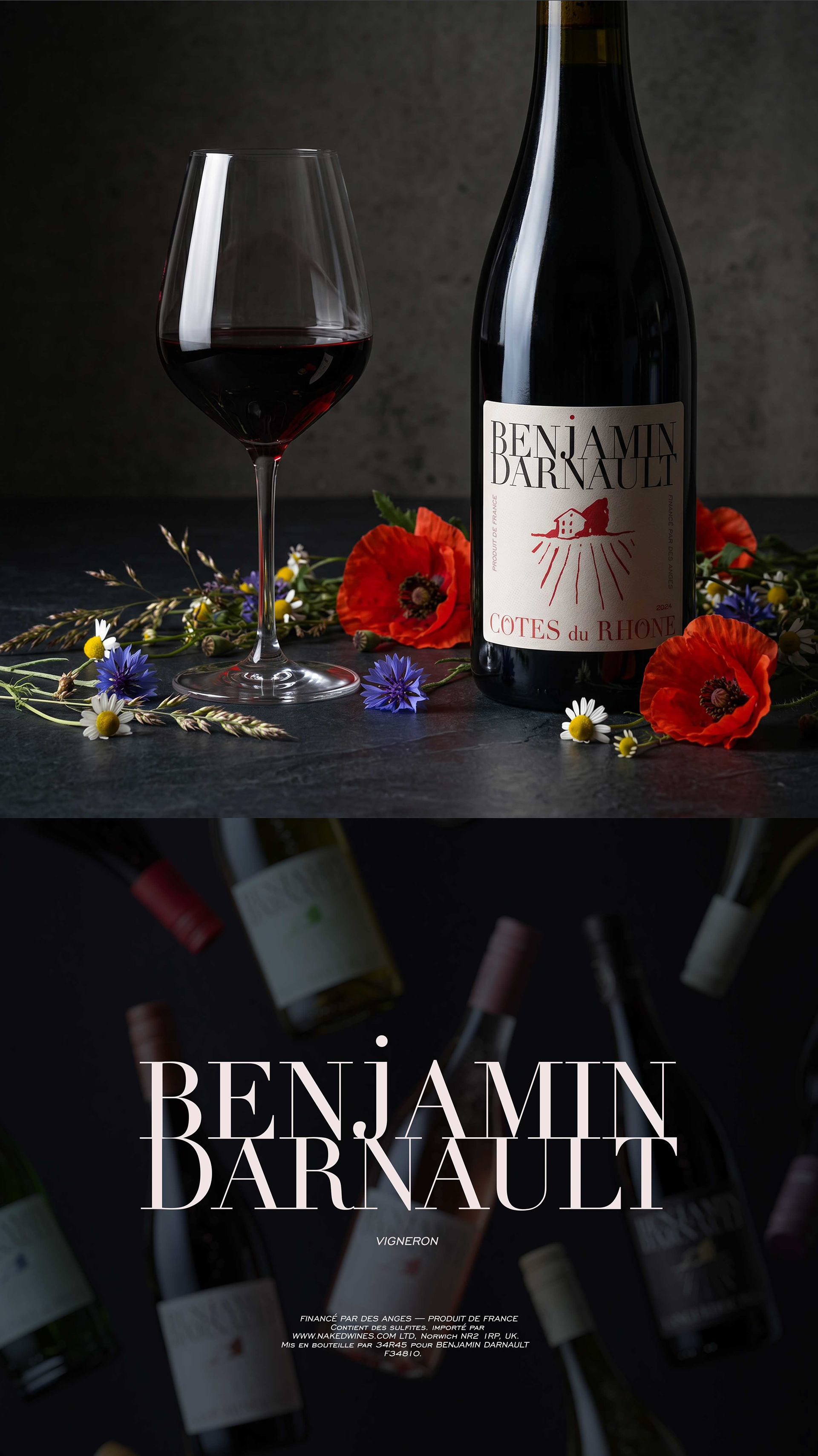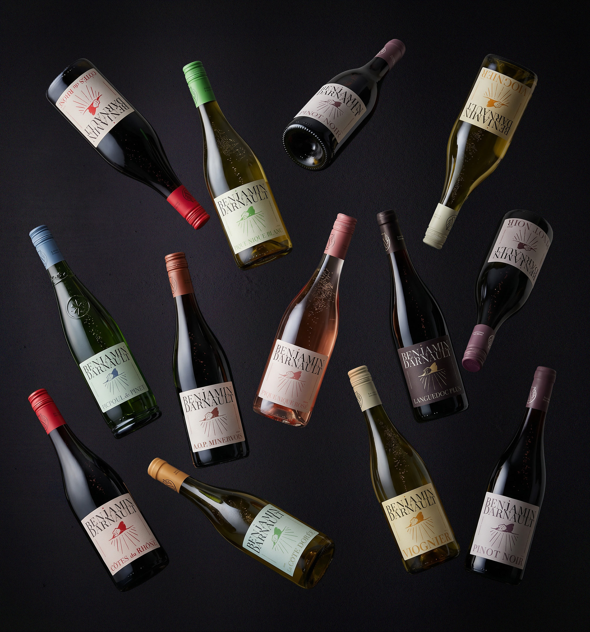
Benjamin Darnault Wines Rebrand
South of France
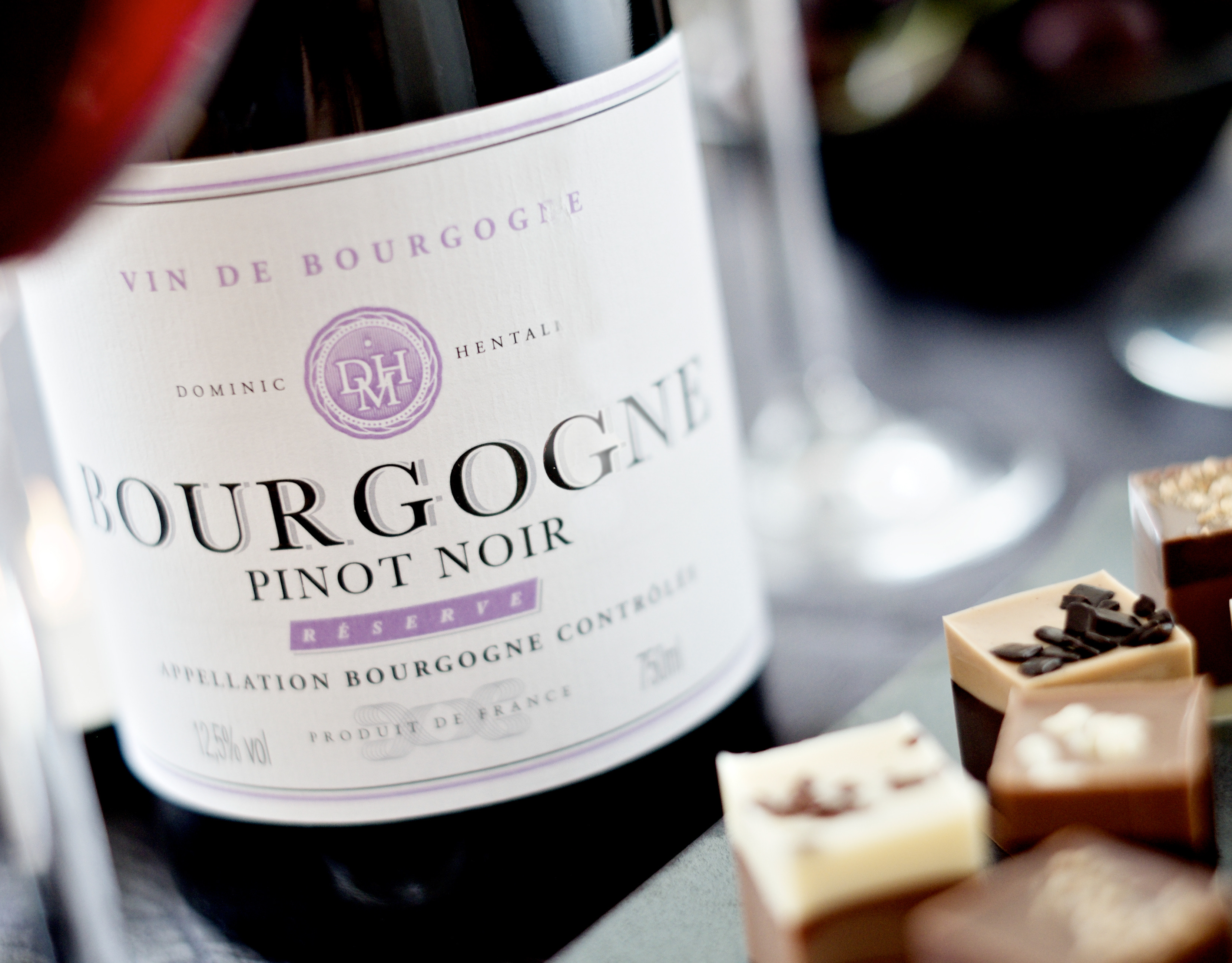
Since 2009, Benjamin Darnault has built one of Naked Wines' flagship ranges, selling millions of bottles across the UK and US. A hands-on winemaker, Ben works directly with local growers, building long-term relationships that show in the quality of the wines year after year.
The old label
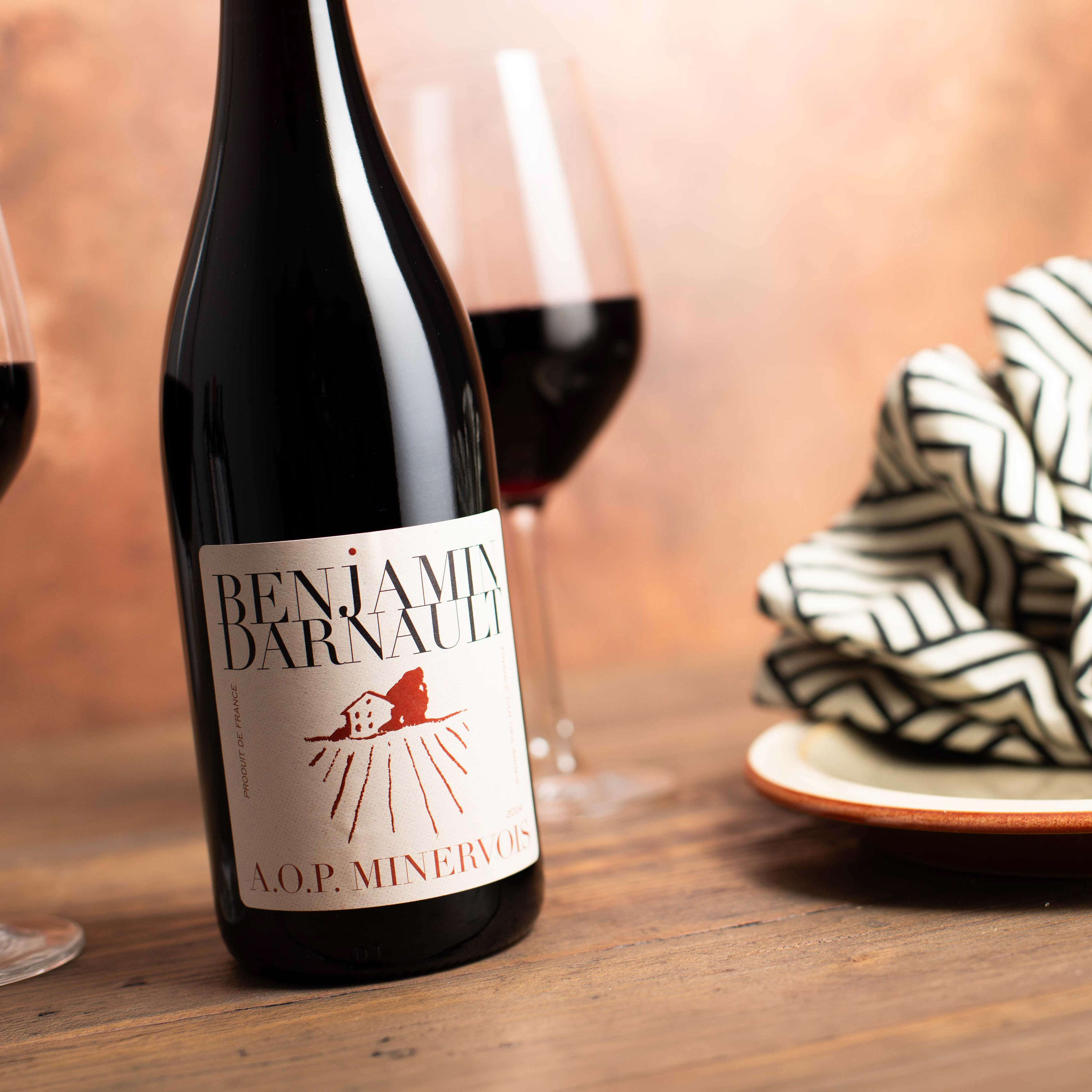
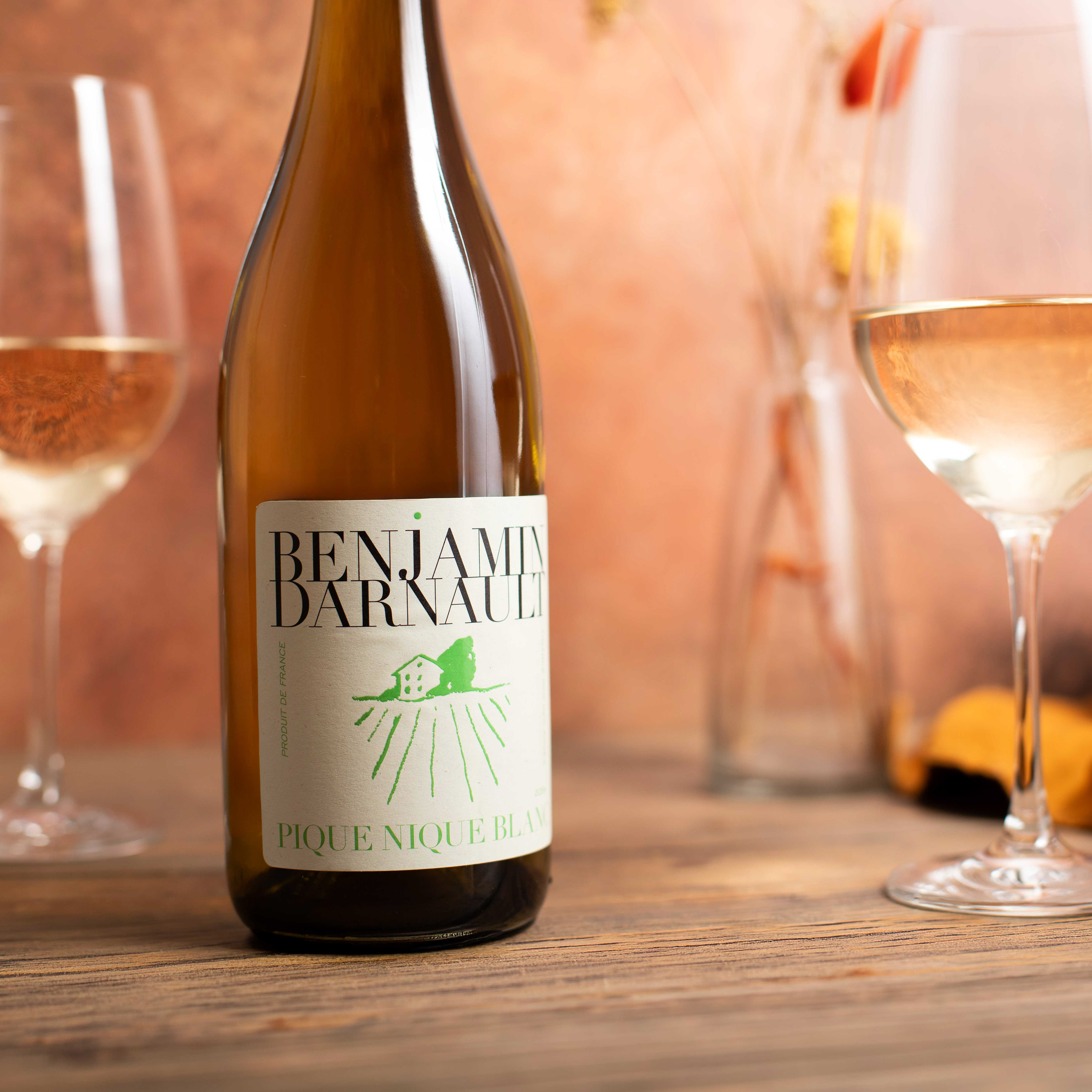
For 16 years, Ben's labels communicated a simple, semi-rustic look. No château, no pretension — just a picture of his house.
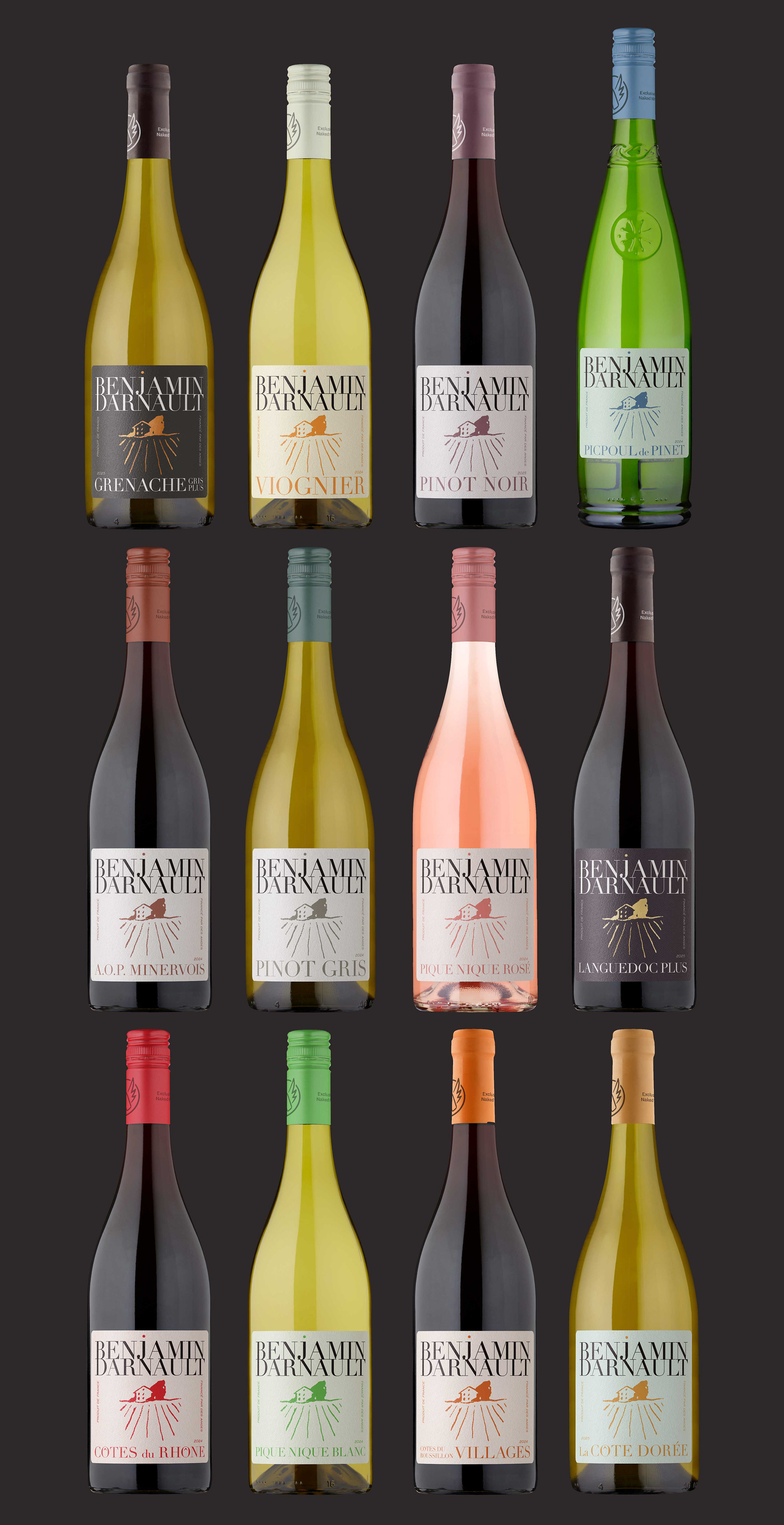
But as the range grew, that simplicity became a problem. The original labels had no visual system to tell varietals apart, and nothing to distinguish entry-level wines from mid-tier ones.
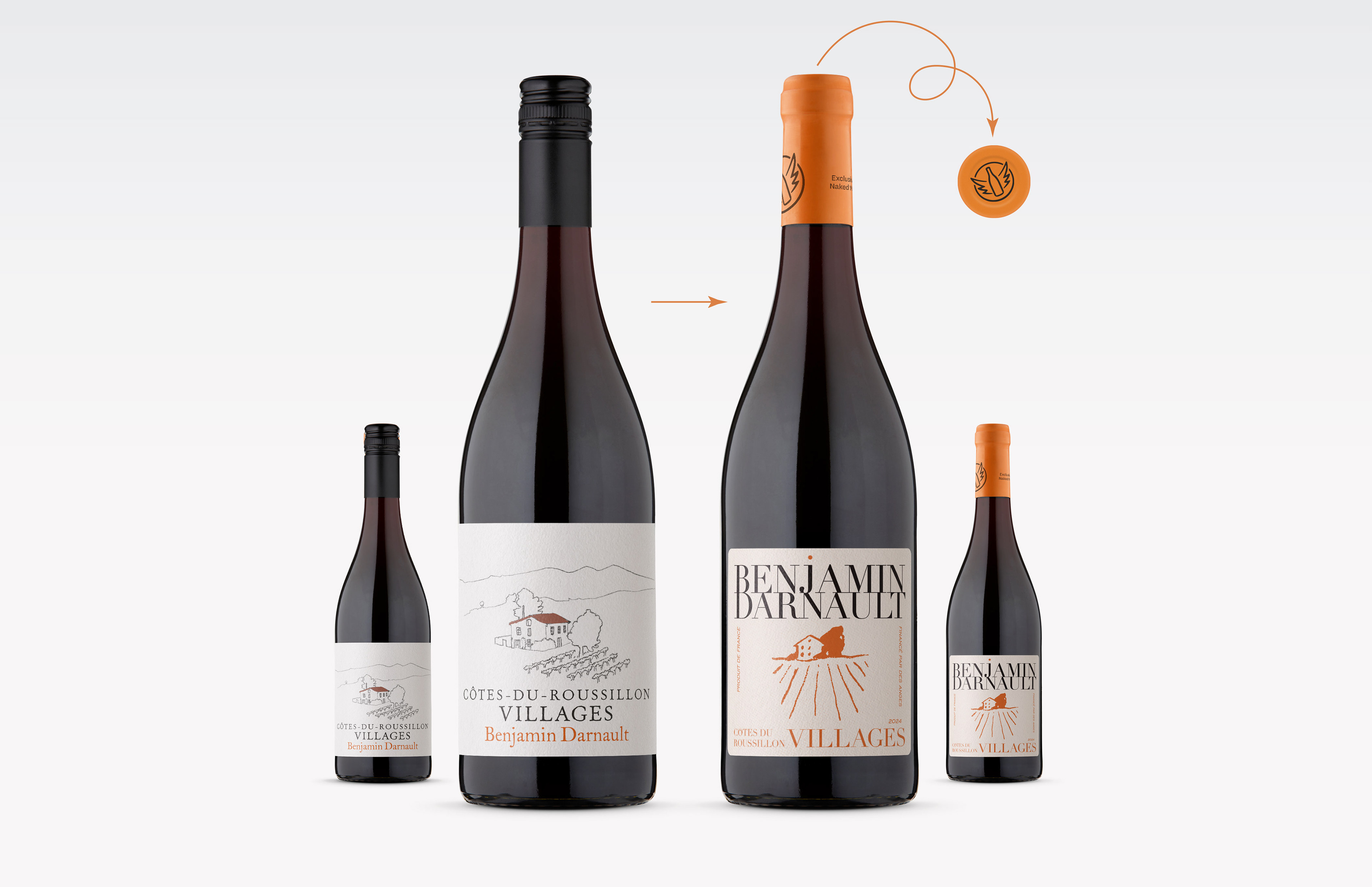
The redesign had three goals:
Make the range easier to navigate, bring more of Ben's personality to the labels, and improve the unboxing experience — because for many new Naked Wines customers, Benjamin Darnault is the first wine they encounter.
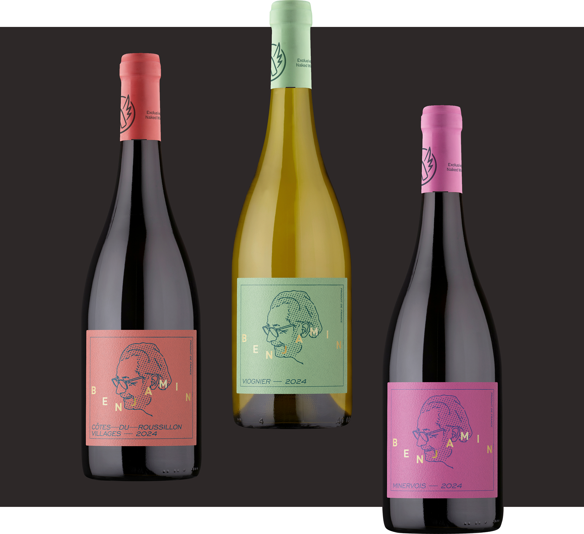
A portrait of Ben
I started with a winemaker portrait. His name is on the bottle, so making him the focus felt like a bold, natural starting point. Paired with a two-colour label, it was simple and fun — but the further I pushed it, the less it felt like Ben. Foil across 14+ SKUs would also add up fast, so on both counts it wasn't the right direction.
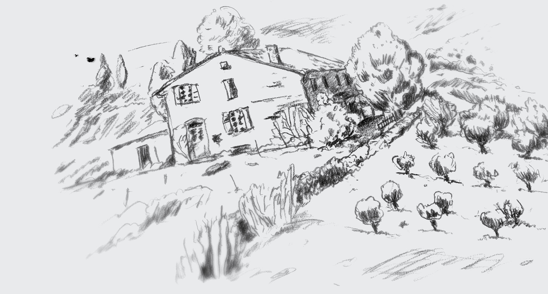
Revisiting the house
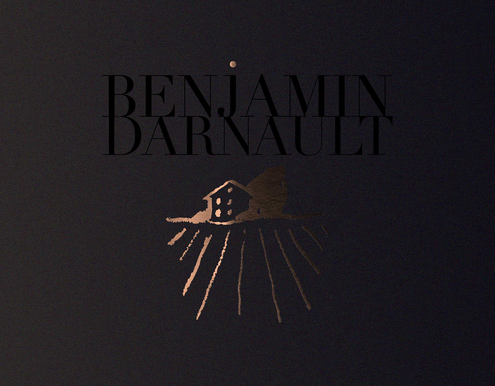
Then I drew a small, chunky version almost as a throwaway — and that roughness was exactly right. Naive, unpretentious, a little handmade. It clicked immediately.
To contrast the weight of the illustration, I paired it with a classic serif — then pushed the typography to add some personality. Structured but playful.