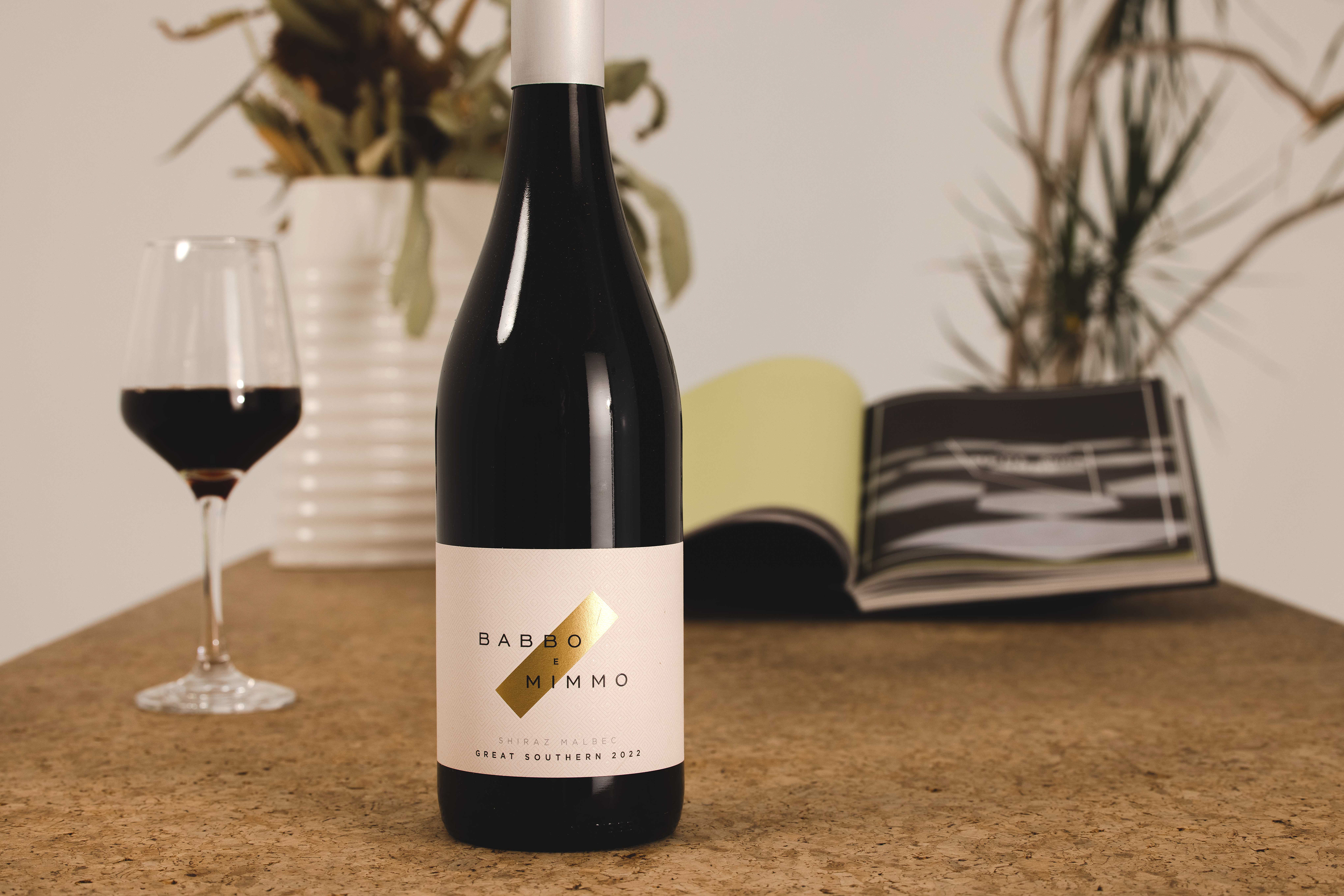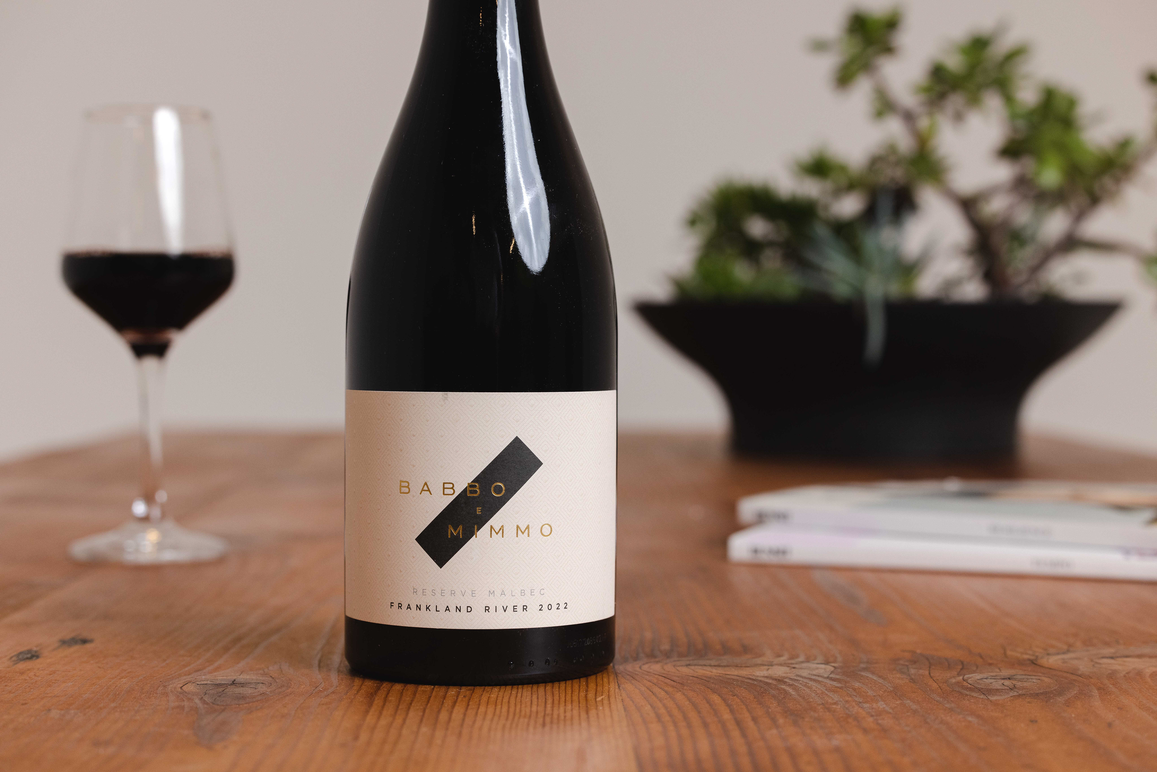
Babbo e Mimmo
Australia
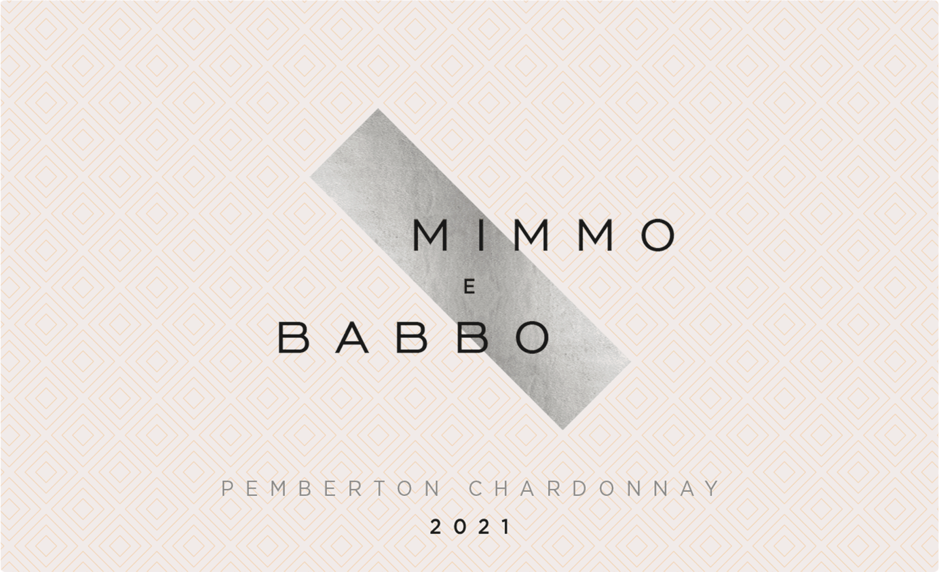
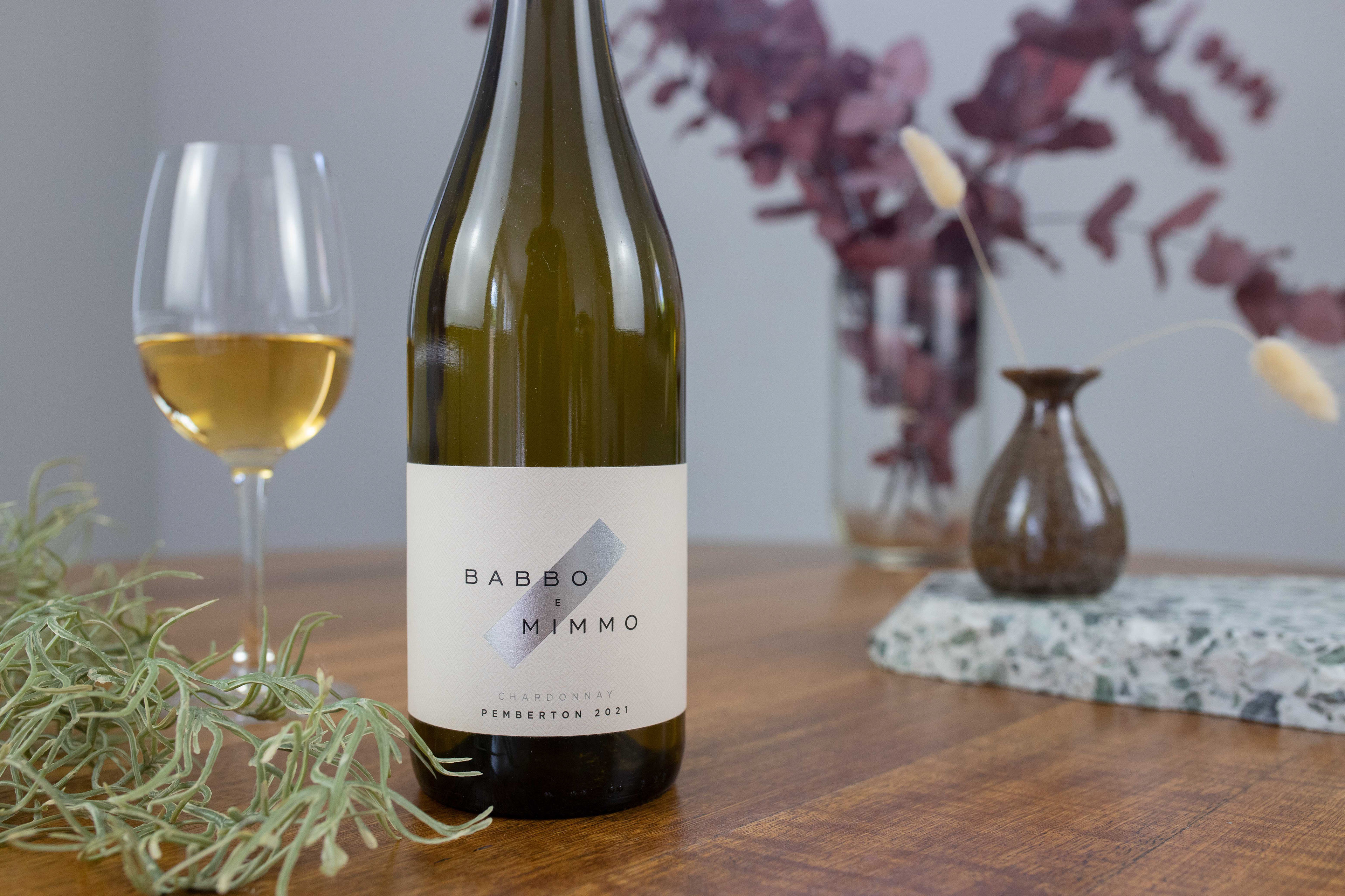
Father–son winemaking duo Mike ("Babbo") and Callum ("Mimmo") take turns leading each release in the range. Early naming concepts explored alternating the label to reflect who was in charge, but this approach risked confusing customers.
The label system reflects their partnership through a diagonal foil stripe, acting as both a connecting mark and a visual divider between names. A light geometric pattern printed on textured paper adds structure and premium detail. Foils vary from gold to silver to black across the range, helping distinguish varietals while retaining a cohesive brand look.
Minimal, modern type keeps the design confident and clean, allowing the visual hierarchy and contrast to do the heavy lifting